Introduction
The Samsung Family Hub is a Internet of Things (IoT) refrigerator manufactured by Samsung that features a 21-inch touch screen on the door, 3 internal cameras for food monitoring, and a suite of apps to extend the fridge experience beyond the kitchen.This project is a concept redesign of the existing Family Hub companion app to the fridge.
Goals
The goal of this project is to recreate the companion app to the Samsung Family Hub with improved usability and feature prioritization in mind.The app will give users the ability to check what’s in their fridge, update their shopping lists, pick recipes for future meals, and post notes for the family to see.
Team
Veronica Lopez - Project ManagerMary Buckingham - User/Brand Research Lead
Alan Zhu - Visual Design Lead
Platform
Mobile | Android (Samsung Galaxy S7)Tools
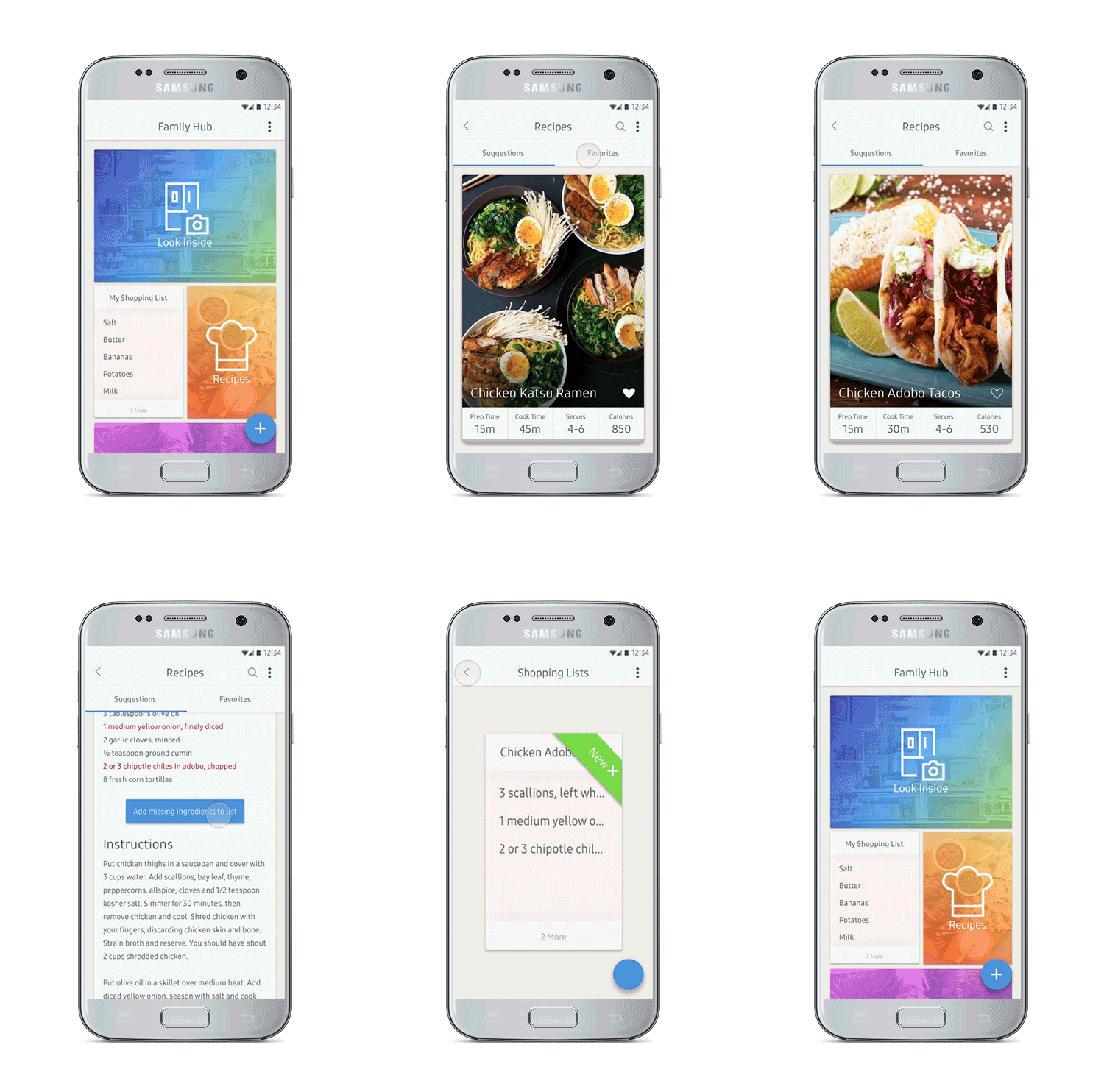
Sketch, Figma, Adobe Illustrator, Marvel, Principle, XtensioBefore jumping into the process about how we designed this app, here is a quick glimpse at the final product:
Research
Research Goals
Before the design even began, we established the goals of our research phase that would be used to inform every step of the process.
1.
Determine users' shopping and eating habits
We wanted to see how users were using the Samsung Family Hub differently than they would a traditional refrigerator.
2.
Find out what mood/emotion users associate with the kitchen
This would help us find user pain points to address and positive experiences that we could extend beyond the kitchen.
3.
See how users communicate with their families
The fridge is often the center of the household where families leave notes for each other, so we wanted to see if we could bring this into the redesign as well.
User Interviews
The first thing that we did in our research was to find current users of the Samsung Family Hub fridge.
Due to the limited early adoption of smart fridge technology, we were unable to find local owner of the Samsung Family Hub. Thus we resorted to studying product reviews on YouTube (such as the one below), reaching out to reviewers, and organizing remote Skype/FaceTime interviews.
These interviews gave us a better understanding of user goals and pain points.
Interview Insights
- Users typically shop on a need basis, rather than in bulk
- Users rely on recipes to cook
- The camera feature is used to check what’s in the fridge when out shopping
- Most users feel that cooking is a chore/stressful
- The app is generally used outside of the kitchen
User Persona
We synthesized our findings from our interviews to craft our user persona. The main purpose of this was to act as a lens that would help us keep the design focused on the user. We found that most of the assumptions we made about the user before the research began were proven to be false.
Andrew Parker
42 Years Old2 Children
Owns Samsung Family Hub and Samsung TV
Goals
- To have access to quick and healthy recipe recommendations
- To be able to look inside the fridge outside of the kitchen
- To know when food inside the fridge is about to expire
Frustrations
- Too many features to figure out
- Companion app mirrors the fridge experience, instead of augmenting it
- Interactions are not quick and easy
Comparative Analysis
Since the market is still relatively new, there were no direct competitors that we could research. We turned instead to other IoT apps to see what kinds of solutions and features they were implementing for the user.
We looked at Amazon Alexa, Google Home, and Nest.
Amazon Alexa
- Interactions with the IoT devices are recorded in the Alexa Android/iOS app
- Users can Install additional functionality from the Alexa app
Google Home
- Users only need to be on the same wireless network to connect to the Cast device
- Users can see the current state of the Cast device remotely
Nest
- Users have direct access to Nest device functionality, such as home temperature and camera feeds
Research Takeaways:
Before jumping into the ideation phase, we summed up all of the major takeaways from our research:
- The app should extend the user's experience beyond the kitchen.
- Users should not have to create an account just to connect a device, the app should scan the wireless network instead.
- We discovered that temperature control was not as important as knowing what was in the fridge.
- The most important thing for users was food management and recipe suggestions.
Again, users wanted the app to be an extension of the fridge, not just a feature mirror.
Ideation
Samsung UX Story
Instead of moving straight into selecting features for the app, we wanted to make sure we were incorporating Samsung's design philosophy into this project (which is also why we decided to design for Android). Fortunately, Samsung already has a UX Design Story for the Family Hub. We used the following insights from this design story to inform the rest of our design process, from feature set to interactions and animations:
Although these insights were taken from observing user interactions with the fridge, we found it valuable to maintain these in our design of the companion app.
Current App Features
We took a look at screenshots of the current companion app and found that the insights from the UX story above were not applied to the design.
Some of the biggest problems were:
- No hierarchy. All features are visually of equal importance, which we found was not the case
- Calendar was the first main thing users see, our research determined that this was not a frequently used feature.
- Some of the functions of the features are obscure. What's the difference between "Memo" and "Whiteboard" or between "To Do" and "Shopping List"?
Screenshot of the Samsung Family Hub app taken from the Google Play Store
Feature Bloat
To align with the idea of MVP (Minimum Viable Product), we removed the following features
- Calendar
- To Do
- Whiteboard (combined with Memos)
- Upload Photos
- Fridge Controls
We removed these features since they added to the bloat and frustration for users. By narrowing the scope of the app, we lightened the cognitive load for the user, and determined our MVP (Minimum Viable Product).
Feature Prioritization
After finding the most important features from our research, and slimming down the current product, we conducted a feature prioritization study to help us start on the information architecture. We also performed several open card sorts to aid this process.
Problems
- Users don't always know what is in the fridge
- Expiration dates are often forgotten
- Users don't know what they want to eat
- Users don't make use of what's available
Goals
- See interior of fridge remotely
- Easy visualization of expiration dates
- Suggestions for dinner based on what's in stock
- Inventory of items in the fridge
Features
- Instant access to an image of fridge interior
- At-a-glance countdown to food expiration
- Recipe suggestion engine that uses current fridge items as ingredients
- Shopping list generator for missing ingredients*
- A notes function for communication**
The features under the "Features" column became the core of the app.
- See Inside Fridge (with expiration dates)
- Recipes
- Shopping List
- Notes
**The "Notes" feature was not a priority, but due to the modular design of the app that will be explained in the next major section, was added to introduce the concept of additional feature implementation
Information Architecture
We centered the four main features above into a sitemap shown below, that would outline how users could move through the app.
Inside Fridge, Recipes, Shopping Lists, and Notes are the core features (MVP). The dotted lines represent connections between screens that do not require the user to return to the home. The green "+" sub-navigation architecture represents the persistent floating navigation button.
Design
Low-Fidelity Wireframes/Wireflow
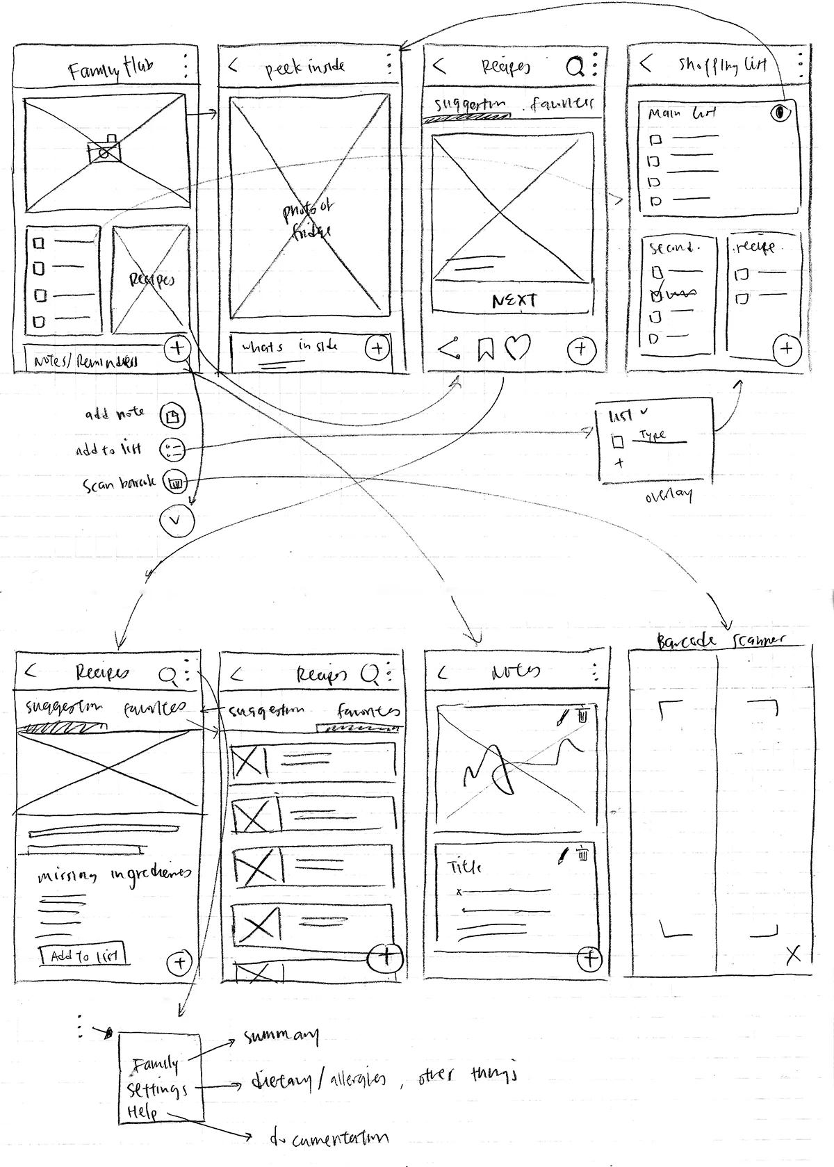
I created low-fidelity wireframes and a wireflow to create a more visual representation of IA shown in the previous section. Most of the visual elements shown here are retained, such as:
- 3-dotted menu at the top right
- Persistent floating nav button
- Card-based modular design
Medium-Fidelity Wireframes
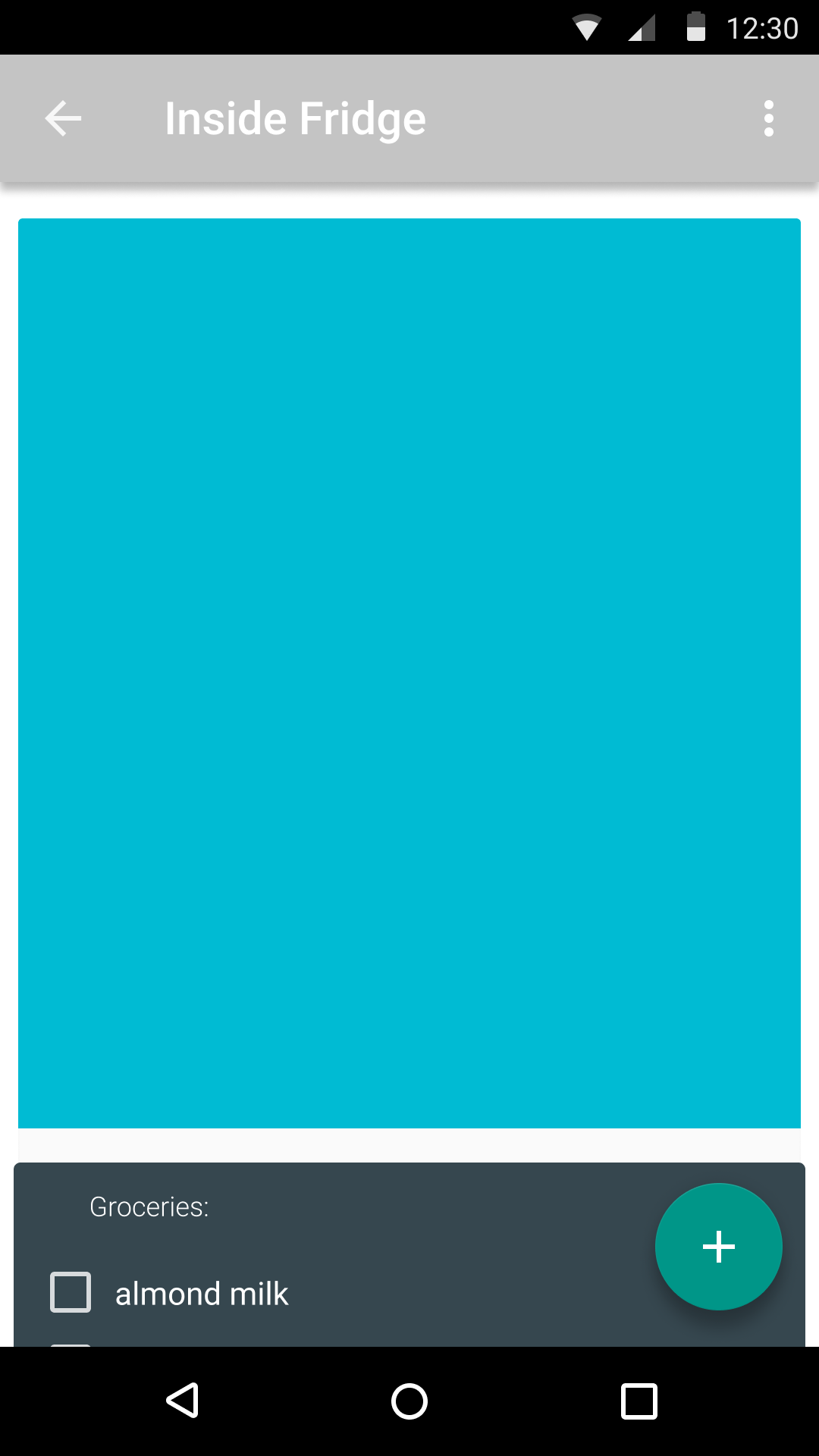
After the low-fidelity wireframes were created, we moved into Figma and started digitizing them using Android Material Design templates and assets. Some of these elements will later be removed when moving into high-fidelity mockups since the Samsung ecosystem does not strightly follow Material Design guidelines.
Below from left to right:
- Home
- Inside Fridge
- Recipes
- Shopping Lists (with floating nav overlay)
High-Fidelity Mockups
For the high-fidelity mockups, we retained most of the design cues from the current app such as color, font, and iconography. The card-based modular design can clearly be seen in these mockups, and persists throughout every screen of the app.
Prototype
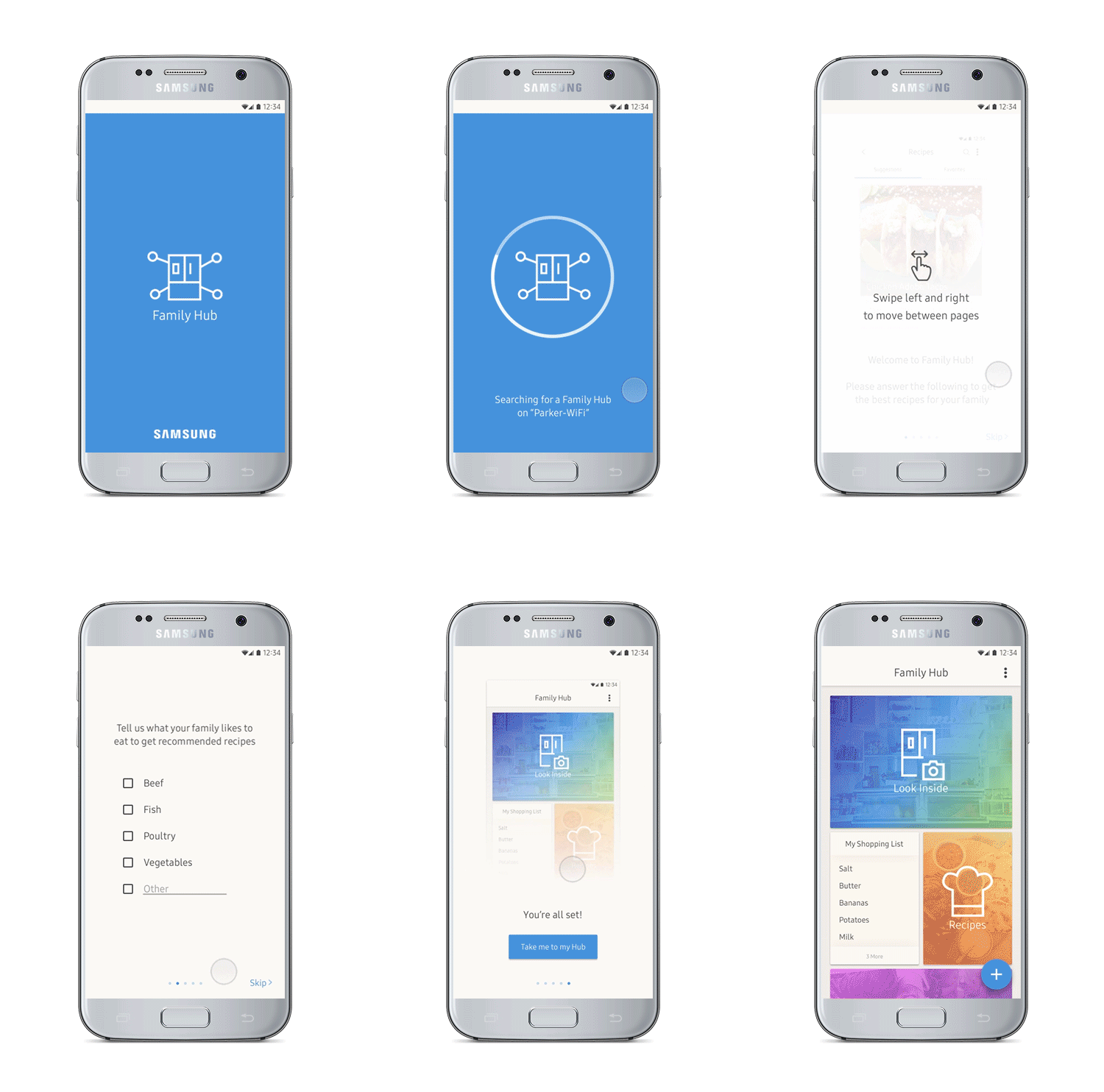
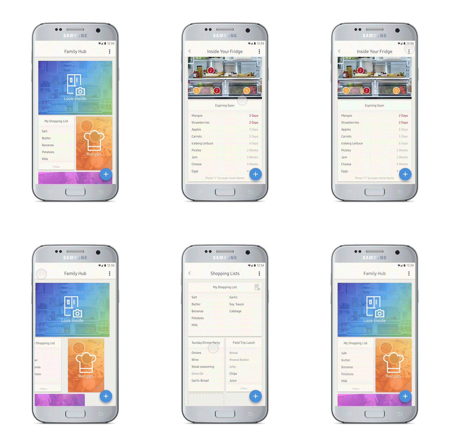
Below is the prototype of the app, created entirely in Principle for Mac. It showcases the interactions and the modular design of the app. The full video for the prototype can be found here.
Onboarding Flow
Inside Fridge, Shopping List, and Floating Nav
Recipe Suggestion and Add Missing Ingredients


